Quantcast
Channel: Material Design
Viewing all 15 articles
Browse latest View live

How to use the Material Design theme with Dragablz Tab Control

$
0
0

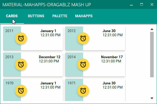
In this post I will demonstrate how to – very quickly – combine Dragablz and MaterialDesignColors in WPF to create a great looking control which supports full tear out and can use the Google Material Design colour palette.

Dragablz Tab Contrtol and Material Design

Start a new WPF project.  We rely on two NuGet packages, so get them installed straight away.  Install from the Package Manager tool in Visual Studio, or, from the NuGet console run these commands:

Install-Package Dragablz
Install-Package MaterialDesignColors

In the MainWindow.xaml, setup a simple usage of Dragablz TabablzControl:

<Window x:Class="MaterialDesignTabExample.MainWindow"
        xmlns="http://schemas.microsoft.com/winfx/2006/xaml/presentation"
        xmlns:x="http://schemas.microsoft.com/winfx/2006/xaml"
        xmlns:dragablz="clr-namespace:Dragablz;assembly=Dragablz"
        Title="Material Design Demo" Height="350" Width="525">
    <dragablz:TabablzControl>
        <dragablz:TabablzControl.InterTabController>
            <dragablz:InterTabController />
        </dragablz:TabablzControl.InterTabController>
        <TabItem Header="HELLO">
            <TextBlock HorizontalAlignment="Center" VerticalAlignment="Center">Hello World</TextBlock>
        </TabItem>
        <TabItem Header="MATERIAL">
            <TextBlock HorizontalAlignment="Center" VerticalAlignment="Center">Material Design</TextBlock>
        </TabItem>
        <TabItem Header="DESIGN">
            <TextBlock HorizontalAlignment="Center" VerticalAlignment="Center">Looks Quite Nice</TextBlock>
        </TabItem>
    </dragablz:TabablzControl>
</Window>

Already if you run this project you will have a tab control that supports Chrome-style tearing out of tabs. But it wont look too good. So, the next step is to bring in the Material Design colours, and tell Dragablz to use the Material Design style.

Open up your App.xaml. We have to merge in three dictionaries.  The first two are to set up your Material Design colour palette.  The MaterialDesignColors assembly contains a ResourceDictionary for each color (a collection of hues and accents).  To create a full palette we need to bring in a primary colour, set up some hue brushes, and then bring in a secondary color for our accent color.  The third resource dictionary is to include the Dragablz theme for Material Design.  Finally we instruct our tab control to use the correct style.

Don’t worry, it’s not too complicated.  The full App.xaml is below:

<Application x:Class="MaterialDesignColors.WpfExample.App"
             xmlns="http://schemas.microsoft.com/winfx/2006/xaml/presentation"
             xmlns:x="http://schemas.microsoft.com/winfx/2006/xaml"
             xmlns:dragablz="clr-namespace:Dragablz;assembly=Dragablz"
             StartupUri="MainWindow.xaml">
    <Application.Resources>
        <ResourceDictionary>
            <ResourceDictionary.MergedDictionaries>
                <!-- primary color -->
                <ResourceDictionary>
                    <!-- include your primary palette -->
                    <ResourceDictionary.MergedDictionaries>
                        <ResourceDictionary Source="pack://application:,,,/MaterialDesignColors;component/Themes/MaterialDesignColor.Indigo.xaml" />
                    </ResourceDictionary.MergedDictionaries>
                    <!--
                            include three hues from the primary palette (and the associated forecolours).
                            Do not rename, keep in sequence; light to dark.
                        -->
                    <SolidColorBrush x:Key="PrimaryHueLightBrush" Color="{StaticResource Primary100}"/>
                    <SolidColorBrush x:Key="PrimaryHueLightForegroundBrush" Color="{StaticResource Primary100Foreground}"/>
                    <SolidColorBrush x:Key="PrimaryHueMidBrush" Color="{StaticResource Primary500}"/>
                    <SolidColorBrush x:Key="PrimaryHueMidForegroundBrush" Color="{StaticResource Primary500Foreground}"/>
                    <SolidColorBrush x:Key="PrimaryHueDarkBrush" Color="{StaticResource Primary700}"/>
                    <SolidColorBrush x:Key="PrimaryHueDarkForegroundBrush" Color="{StaticResource Primary700Foreground}"/>
                </ResourceDictionary>

                <!-- secondary colour -->
                <ResourceDictionary>
                    <!-- include your secondary pallette -->
                    <ResourceDictionary.MergedDictionaries>
                        <ResourceDictionary Source="pack://application:,,,/MaterialDesignColors;component/Themes/MaterialDesignColor.Yellow.xaml" />
                    </ResourceDictionary.MergedDictionaries>

                    <!-- include a single secondary accent color (and the associated forecolour) -->
                    <SolidColorBrush x:Key="SecondaryAccentBrush" Color="{StaticResource Accent200}"/>
                    <SolidColorBrush x:Key="SecondaryAccentForegroundBrush" Color="{StaticResource Accent200Foreground}"/>
                </ResourceDictionary>

                <!-- Include the Dragablz Material Design style -->
                <ResourceDictionary Source="pack://application:,,,/Dragablz;component/Themes/materialdesign.xaml"/>                

            </ResourceDictionary.MergedDictionaries>

            <!-- tell Dragablz tab control to use the Material Design theme -->
            <Style TargetType="{x:Type dragablz:TabablzControl}" BasedOn="{StaticResource MaterialDesignTabablzControlStyle}" />
        </ResourceDictionary>
    </Application.Resources>
</Application>

And that’s it. Fire up your baby and you are done. You can change the colours by changing the two colour resource dictionaries which are referenced. You can also tweak the hues, but do not change the brush names.  Dragablz will be looking for these.

Links:

Enjoy!


Material Design In XAML – Mash Up!

$
0
0

I have previously posted about the Material Design theme for Dragablz.  In this post I will describe how I arrived at this application mock-up, by combining Dragablz, Material Design in XAML Toolkit, and MahApps:

Material Design Demo

My initial task when creating that style was to create a separate, and composable way to define the Material Design colour palette for your application.  Making the separation between the colours and the Dragablz Material Design theme immediately paid benefit.  Being a big fan of MahApps and I was easily able to take things a step further and use the palette in conjunction with a MahApps MetroWindow. Encouraging MahApps to pick up my Material Design palette turned out to be easy because of the way the MahApps guys had also separated out their accents.  Very quickly, I had a MahApps MetroWindow up and running, using MahApps themed controls, the Dragablz Material Design theme, and all of which were using the Material Design palette.  It looked pretty good straight away.

I’ve previously posted on how to choose a Material Design palette, but for a refresher, take a look at this App.xaml.

In addition to the Material Design palette, you need to set a base theme; light or dark.  So add this resource dictionary to your App.xaml:

<ResourceDictionary Source="pack://application:,,,/MaterialDesignThemes.Wpf;component/Themes/MaterialDesignTheme.Light.xaml" />  

Getting MahApps to use the Material Design palette only takes a few extra lines in your App.xaml.  Firstly, merge in some of the usual MahApps dictionaries:

<ResourceDictionary Source="pack://application:,,,/MahApps.Metro;component/Styles/Controls.xaml" />
<ResourceDictionary Source="pack://application:,,,/MahApps.Metro;component/Styles/Fonts.xaml" />
<ResourceDictionary Source="pack://application:,,,/MahApps.Metro;component/Styles/Colors.xaml" />
<ResourceDictionary Source="pack://application:,,,/MahApps.Metro;component/Styles/Accents/BaseLight.xaml" />

Then, where you specify the primary Material Design colour, setup the MahApps brushes, but instead of pulling in one of the MahApps accent dictionaries, configure them manually, to use the Material Design palette:

<SolidColorBrush x:Key="HighlightBrush" Color="{StaticResource Primary700}" options:Freeze="True" />
<SolidColorBrush x:Key="AccentColorBrush" Color="{StaticResource Primary500}" options:Freeze="True" />
<SolidColorBrush x:Key="AccentColorBrush2" Color="{StaticResource Primary400}" options:Freeze="True" />
<SolidColorBrush x:Key="AccentColorBrush3" Color="{StaticResource Primary300}" options:Freeze="True" />
<SolidColorBrush x:Key="AccentColorBrush4" Color="{StaticResource Primary200}" options:Freeze="True" />
<SolidColorBrush x:Key="WindowTitleColorBrush" Color="{StaticResource Primary700}" options:Freeze="True" />
<SolidColorBrush x:Key="AccentSelectedColorBrush" Color="{StaticResource Primary500Foreground}" options:Freeze="True" />

For a complete example see this App.xaml.

Any controls added to your Window (or Dragablz TabablzControl) will now default to MahApps styles, but use the Material Design palette, leaving your application looking pretty good. Having got to this point myself, I couldn’t help but start playing around a bit further with some Material Design. I created a list box with a few cards and the result looked pretty promising:

MaterialDesignEarlyPrototype

It wasn’t long before I went even further and started styling a whole bunch of controls, and ended up with these:

MaterialDesignDemo2

I’ve packaged all these themes (and will continue to add to) on NuGet:

Install-Package MaterialDesignThemes

Where appropriate in your app you can include one or more of the contained resource dictionaries and use the Material Design style for a control in place of the MahApps. All of your other controls will still use the MahApps themes, meaning your application should always look great. A thorough-bred mash-up :)

To select the appropriate resource dictionary and style name the best thing to do is download the source/demo solution from GitHub and run the two projects in the solution:

  • MahMaterialDragablzMashUp
  • MaterialDesignColors.WpfExample

Or, take a look at this MainWindow.cs.

Hope that all helps you get a good looking application up and running quickly!

As an end note I must mention this great piece of styling in WinForms, which inspired me to create the Material Design theme for Dragablz in the first place.


Material Design DatePicker/Calendar Style for WPF

$
0
0

Howdi,

After a bit of toil I have the DatePicker and Calendar WPF control styles done for Material Design in XAML Toolkit. I hope you guys like it!

(Edit: TimePicker & Clock now also available, blogged here)
Material Design templates for DatePicker/Calendar primitive controls.

Please note that the behaviour is not quite identical to that which you might see on Android. These are templates for the existing WPF DatePicker and Calendar primitive controls, and thus, some of the behaviour around month/year selection is driven by the nature of those controls. There is no modal dialog, as I don’t want these templates to get confused with any requirement/API used to manage dialogs in WPF.

I must say that I believe that it is testament to the original design of WPF/XAML – which is now a mature technology – that I could slot these styles in pretty much seamlessly for a control whose code base is around 8 years old. Note that some extra code has gone in to the Material Design Toolkit, bit this is wrapped inside the new templates and thus if you consume these templates you need never concern yourself with it.

Getting started:

If you haven’t taken a look at Material Design in XAML Toolkit yet (or indeed Dragablz) here is a blog post to get started, or download the source from GitHub and fire up the demo projects:

  • MaterialDesignColors.WpfExample
  • MahMaterialDragablzMashUp

Thanks due:


Material Design Themed TimePicker and Clock Controls for WPF

$
0
0

I’ve managed to get the existing WPF controls; DatePicker & Calendar themed as part of Material Design in XAML Toolkit as described in this blog post.

But the fun part was cranking a couple of brand new controls to build the Material Design time picker experience:

  • TimePicker
  • Clock

These are sibling controls to the existing DatePicker and Calendar controls.  I wanted to keep the API experience similar so you can dive straight in without any kind of learning curve.  The Clock can be used in isolation, or use the DatePicker for an easy picker/popup/drop down behaviour.

Here’s a static glimpse at the picker:

Material Design Time Picker

And here’s a gif of the clock in action:

Material Design Clock Demo

There’s nothing complicated about using these, but you will need to get Material Design In XAML Toolkit referenced and set up in your app. Follow the initial tutorial, and head over to GitHub to download the source/examples project.


Open Sourcing a Logo

$
0
0

Open source doesn’t have to just apply to code.  I’ve been applying my XAML skills to Material Design In XAML Toolkit to help other developers quickly craft good looking user interfaces in WPF.  I’m pretty happy with the results, and in some of my own projects I’ve produced some striking applications using the toolkit.  Despite doing this, I readily admit I’m no designer.  For such a visually focused code library I really wanted a logo, but knew I could never do the task justice.

So I threw the task out to the community.

I created an issue on GitHub, tweeted a bit, posted on Reddit.  And waited.  Pretty much bang on 2 weeks later a result came back from a young guy called Sam, and I’m really happy with it:

Material Design In XAML Toolkit

Sam or “snalty” can be found on Twitter, and you can see some of his other designs on his blog.

In summary, a great bit of collaboration helping to push Material Design In XAML Toolkit further along.


React.js and Material Design Lite

$
0
0

I’m a bit of a React.js fan lately, and with the arrival of Google’s Material Design Lite, I decided to combine them for a little project I’m throwing together.  Turns out to be pretty easy.  To simplify the Getting Started, you need to include a .css and .js file in your page:

<link rel="stylesheet" href="https://storage.googleapis.com/code.getmdl.io/1.0.0/material.grey-blue.min.css" />
<script src="https://storage.googleapis.com/code.getmdl.io/1.0.0/material.min.js"></script>

…and then show a Material Design button using the following class names:

<button class="mdl-button mdl-js-button mdl-button--raised mdl-button--accent mdl-js-ripple-effect">
  Button
</button>

The small gotcha for using templating techniques for dynamic pages such as with React.js is that for buttons, and other items, dynamically added you need to call a bit of script to upgrade the button:

//where button is your DOM element
componentHandler.upgradeElement(button, 'MaterialButton');

But when we come to create our React class, that’s easily handled in componentDidMount, leaving my Material Design Lite button class looking like this:

var MdlButton = React.createClass({
	handleClick: function() {
		this.props.onClick();	
	},
	render: function() {
		return (
			<button ref="btn" className="mdl-button mdl-js-button mdl-button--raised mdl-button--accent mdl-js-ripple-effect"
					onClick={this.handleClick}>
				{this.props.content}
			</button>
		);
	},
	componentDidMount: function() {
		componentHandler.upgradeElement(React.findDOMNode(this.refs.btn), 'MaterialButton');		
	} 
});

One small thing to note is the second arg to upgradeElement where we are passing in ‘MaterialButton’. As of now the docs aren’t overly clear on this, but it’s the name of the Javascript function object defined in the source. So, if we want to create a check box React class we can dig in to the Material Design Light source code in GitHub, and confirm that we’d pass ‘MaterialCheckbox’ into upgradeElement.

No doubt the community will provide a full library for this in time, but it doesn’t take much to combine these two libraries.


Version 1.0 of Material Design In XAML has arrived!

$
0
0

Well, this project kinda came out of nowhere, but has proven to be pretty popular and I’ve really enjoyed getting it to this state: version 1.0!   It’s officially a non-alpha, non-beta, totally live thing!!

I’ve cranked up my contributions over the last month to push it over the line for its for first official release, recently adding runtime palette switching via the PaletteHelper/Swatch API, a new ColorZone control to help you design your layouts, and more granular control of ripples and shadows.  A few styles and animations have also been tweaked to really improve the look and feel.

To go with version one I’ve completely re-worked the demo app, as illustrated in the video.  It’s really worth checking, it might just give you some inspiration for your WPF apps!

And if you haven’t seen I recently launched a new home page for the project: materialdesigninxaml.net, which includes a Get Started section.

There’s still plenty more to come for both Material Design In XAML and Dragablz but I will be treating myself to a little break for a week or two!


Bending the WPF ProgressBar

$
0
0

There’s plenty progress loop controls around for WPF, but for Material Design In XAML Toolkit I really wanted to stick to “themeing” existing framework controls where-ever possible. Here’s examples of what were trying to achieve from Google’s own documentation, if you have an Android phone you’ll no doubt have seen these in action:

Before I tackled the style I spent a few weeks bouncing ideas around in my head.  To create the circular effect we’d have to dust off the trigonometry but I really wasn’t sure if I cold pull it all off inside a WPF Style, without creating a new control, or at least inheriting (yuck) from ProgressBar.  ProgressBar says it all.  It wasn’t really designed to go where I wanted it to go and whilst weighing things up I reflected into the ProgressBar.cs source:


//----------------------------------------------------------------------------
// File: ProgressBar.cs
//
// Description:
// Implementation of ProgressBar control.
//
// History:
// 06/28/2004 - t-sergin - Created
//
// Copyright (C) 2004 by Microsoft Corporation. All rights reserved.
//
//---------------------------------------------------------------------------

Okaaaayyy…so using the ever flexible WPF we are still taking something from 2004 and trying to theme it using 2015 design trends.  Should be fun!  There are a few TemplatePart’s which the code it expects – to draw a standard bar – but fortunately the control is also gracious enough to operate without them.

To create the looping progress ring thingy a simple arc path should do the job:

<Path>
  <Path.Data>
    <PathGeometry>
      <PathFigure StartPoint="?">
        <ArcSegment Size="?" IsLargeArc="?" Point="?" SweepDirection="Clockwise" />
      </PathFigure>
    </PathGeometry>
  </Path.Data>
</Path> 

But you’ll see from the attributes with a ? we’ve got 4 values we’ve got to complete:

  • PathFigure.StartPoint: pretty simple, start the arc at the top, on the middle of the X axis
  • ArcSegment.Size: easy again, this is the radius, so half the size of the control
  • ArcSegment.IsLargeArc: to draw anything over 180deg, this needs to be set to true. We’ll need a multiple values to figure out if we are over half way through progress: ProgressBar.Minumum, .Maximum, .Value
  • ArcSegment.Point: This is where from the StartPoint we need to draw our arc around to. Again we’ll need ProgressBar.Minumum, .Maximum, .Value, and with the wonders of trigonometry we can figure this out.

No worries though, we can wrap all of these little calculations in a bunch of IValueConverter and IMultiValueConverter implementations.  In reality then, bending a straight progress bar into a circle is pretty simple.  The PathFigure – now, peppered with a bunch of value converters – looks a bit like this:


<PathFigure StartPoint="{Binding ElementName=PathGrid, Path=ActualWidth, Converter={StaticResource StartPointConverter}, Mode=OneWay}">
<ArcSegment Size="{Binding ElementName=PathGrid, Path=ActualWidth, Converter={StaticResource ArcSizeConverter}, Mode=OneWay}" SweepDirection="Clockwise">
<ArcSegment.IsLargeArc>
<MultiBinding Converter="{StaticResource LargeArcConverter}">
<Binding RelativeSource="{RelativeSource TemplatedParent}" Path="Value" />
<Binding RelativeSource="{RelativeSource TemplatedParent}" Path="Minimum" />
<Binding RelativeSource="{RelativeSource TemplatedParent}" Path="Maximum" />
<Binding ElementName="FullyIndeterminateGridScaleTransform" Path="ScaleX" />
</MultiBinding>
</ArcSegment.IsLargeArc>
<ArcSegment.Point>
<MultiBinding Converter="{StaticResource ArcEndPointConverter}">
<Binding ElementName="PathGrid" Path="ActualWidth" />
<Binding RelativeSource="{RelativeSource TemplatedParent}" Path="Value" />
<Binding RelativeSource="{RelativeSource TemplatedParent}" Path="Minimum" />
<Binding RelativeSource="{RelativeSource TemplatedParent}" Path="Maximum" />
<Binding ElementName="FullyIndeterminateGridScaleTransform" Path="ScaleX" />
</MultiBinding>
</ArcSegment.Point>
</ArcSegment>
</PathFigure>

(I don’t think WordPress wants to format that…)

We’re not done there though.  Material Design has extra animation flourishes to provide the extra pzazz.  If you look at the determinate loop in the video above, you’ll see that the whole ring is rotating in addition to drawing out the arc representing completion.  Something, a bit like this:

ProgressRingDoubleRotate

By applying a RotateTransform to the Path itself, and using yet another converter to calculate the rotation according to the percent of completion we can pretty close to the Google effect.


<Path.RenderTransform>
<TransformGroup>
<RotateTransform x:Name="RotateTransform" CenterX="{Binding ElementName=PathGrid, Path=ActualWidth, Converter={StaticResource RotateTransformCentreConverter}, Mode=OneWay}" CenterY="{Binding ElementName=PathGrid, Path=ActualWidth, Converter={StaticResource RotateTransformCentreConverter}, Mode=OneWay}">
<RotateTransform.Angle>
<MultiBinding Converter="{StaticResource RotateTransformConverter}">
<Binding RelativeSource="{RelativeSource TemplatedParent}" Path="Value" />
<Binding RelativeSource="{RelativeSource TemplatedParent}" Path="Minimum" />
<Binding RelativeSource="{RelativeSource TemplatedParent}" Path="Maximum" />
</MultiBinding>
</RotateTransform.Angle>
</RotateTransform>
</TransformGroup>
</Path.RenderTransform>

I’ve actually built further animation storyboards on top of this to try and get close to the indeterminate effect.  It’s not quite perfect yet, but close enough for what I released in version 1.0 of Material Design In XAML Toolkit.  Here’s a gif of how things were looking in that release:

Progress Loops

And, in keeping with my original challenge of staying close to the original .Net Framework controls, usage is pretty straight forward:


<ProgressBar Style="{StaticResource MaterialDesignCicularProgressBar}" Value="50" />

To see it in action run up the demo project which is part of the main source.

The actual final style can be found here:

https://github.com/ButchersBoy/MaterialDesignInXamlToolkit/blob/master/MaterialDesignThemes.Wpf/Themes/MaterialDesignTheme.ProgressBar.xaml

And – as there are a whole bunch of converters – they warrant their own namespace here:

https://github.com/ButchersBoy/MaterialDesignInXamlToolkit/tree/master/MaterialDesignThemes.Wpf/Converters/CircularProgressBar


WPF Dialog Boxes In Material Design In XAML Toolkit

$
0
0

(Note this article refers to a pre-release version, which can be found on nuget provided pre-release versions are included in your search.)

Message boxes.  Ever a source of frustration in WPF.  MahApps has some nice dialog boxes to which I recently helped out with an MVVM API, but Material Design In XAML Toolkit can run with or without MahApps so I wanted a custom implementation which would meet these goals:

  • Look similar to the dialogs we see on Android phones
  • Have an API which is useable from XAML, code-behind, and MVVM
  • Provide full flexibility on the content of the dialog.

All software is evolution and after a reasonable attempt of doing something similar for a client – which ended up with a bit of a code-smell around callbacks from the API – I’ve come up some composable pieces which I hope are flexible, easy to use, and – most importantly – provide an attractive GUI :-)

The cornerstone is the DialogHost control.  It’s a content control, meaning the underlying content over which the popup dialog will be displayed can be targeted; to a specific area of your app, or the entire Window content.


<md:DialogHost>
    <md:DialogHost.DialogContent>
        <dialogContent />
    </md:DialogHost.DialogContent>
    <mainContent />
</md:DialogHost>

When the dialog is open, the underlying content will be dimmed and disabled.

Material Design Dialog

DialogHost.DialogContent (associated with DialogHost.DialogContentTemplate) is your typical XAML content object property for setting the content of your dialog.  You can infer from this that you can use MVVM to bind content, but there are multiple ways of populating the content, showing the dialog, closing the dialog, and processing responses, so here’s a list of all the strategies for using the dialog (after the gif):

Material Design Dialog

Open Dialog Strategies

DialogHost.OpenDialogCommand

<Button Command="{x:Static md:DialogHost.OpenDialogCommand}" />

RoutedCommand typically used from a button where optional content can be provided via the CommandParameter.

DialogHost.IsOpen

<md:DialogHost IsOpen="True" />

Dependency property, to be triggered from XAML, set from code-behind or via a binding.  Content must be set in DialogHost.DialogContent.

DialogHost.Show

DialogHost.Show(viewOrModel);

Async/await based static API which can be used purely in code (for example from in a view model).  Content can be passed directly to the dialog.

Close Dialog Strategies

DialogHost.CloseDialogCommand

<Button Command="{x:Static md:DialogHost.CloseDialogCommand}" />

RoutedCommand, typically used on buttons inside the dialog, where the command parameter will be passed along to the dialog response.

DialogHost.IsOpen

<md:DialogHost IsOpen="False" />

Dependency property, to be triggered from XAML, set from code-behind or via a binding.

HANDLE CLOSE STRATEGIES

The DialogClosingEventHandler delegate is key.  It provides the parameter provided to DialogHost.CloseDialogCommand, and allows the pending close to be cancelled.

The following mechanisms allow handling of this event, via code-behind, MVVM practices, or just from the code API:

DialogHost.DialogClosing

<md:DialogHost DialogClosing="DialogHost_OnDialogClosing" />

Bubbling RoutedEvent, which could be used in code-behind.

DialogHost.DialogClosingAttached

<Button Command="{x:Static wpf:DialogHost.OpenDialogCommand}" md:DialogHost.DialogClosingAttached="DialogHost_OnDialogClosing" />

Attached property, which accepts a DialogClosingEventHandler which makes it easy to subscribe to the closing event in a more localized area of XAML.

DialogClosing.DialogClosingCallback

<md:DialogHost DialogClosingCallback="{Binding DialogClosingHandler}" />

Standard dependency property which enables the a DialogClosingEventHandler implementation to be bound in, typically from a view model.

DialogHost.Show

var result = await DialogHost.Show(viewOrModel, ClosingEventHandler);

The async response from this method returns the parameter provided when DialogHost.CloseDialogCommand was executed.  As part of the Show() signature a DialogClosingEventHandler delegate can be provided to intercept the on-closing event, just prior to the close.

More Examples

More complete usage examples can be found in MainDemo.Wpf which is part of the Toolkit solution, primarily in MainDemo.Wpf/Dialogs.xaml.


Material Design In XAML Toolkit: version 1.2

$
0
0

I’m happy to say that Material Design In XAML Toolkit version 1.2 has rolled, bringing yet more polish and features that are hopefully going to help people bring their desktop applications to life.

Links:

Key features of note:

ComboBox styling

This great PR as brought the combo style bang up to date with Google’s spec, and it looks great.

NewCombo

TimePicker goes 24 hour

24hrClock

<materialDesign:Clock Is24Hours="True" DisplayAutomation="Cycle" />

Thanks to pauloquicoli for helping out here.

Additional Slider theme

9c2a7e3a-8988-11e5-86ac-cef4159ba661

<Slider 
    Minimum="0" 
    Maximum="10" 
    Style="{DynamicResource MaterialDesignDiscreteSlider}"  />

DialogHost improvements

dialogs

The DialogHost control provides Material Designed themed popups and also provides a comprehensive API to deal with popup dialogs, which have traditionally been a pain point for WPF developers. This release polishes some of the API for both MVVM and code-behind scenarios.  Some great community testing has helped round this off, and also some code comes from here.

Read more about DialogHost popups


Thanks to all contributors for helping to not only move this project forward, but also helping drive its success; it’s really exciting how much traction this library has gained since I started it.

Coming Next

For 1.3 I’ve already started working on a “Multiple Floating Action Button” which is quite common on Android, and there will be a few smaller tweaks.  Also, as ever, I’ll be plugging away at Dragablz as I try and approach a version 1.0.  UWP stuff?  Still a pet project at the moment :)


Icon Pack – Material Design In XAML 1.4

$
0
0

New for release 1.4 of Material Design In XAML Toolkit is a full icon pack.  Icon design is a skill itself and finding or creating good icons when designing an application can be a time consuming task.   To help  in this regard I am pleased to announce that the entire Material Design Icons collection is now included in the library.

MaterialDesignIcons.png

It’s a  great collection, containing over 1,400 icons, including many of  the standard icons we see on Android phones and many more additional icons added by its own community.   It’s worthwhile heading over to the website to get an overview of the icons, and there’s a search feature to help  you track down the icon you’re after.

Using the icons in your WPF application is easy.  Assuming you’ve already installed Material Design In XAML Toolkit, the XAML is as simple as:


<materialDesign:PackIcon Kind="ShareVariant" />

To give you: share-variant-16.png

The icons are SVG based, so scale nicely:

<materialDesign:PackIcon Kind="ThumbUp" Height="24" Width="24" />
<materialDesign:PackIcon Kind="ThumbUp" Height="36" Width="36" />
<materialDesign:PackIcon Kind="ThumbUp" Height="48" Width="48" />

thumb-up-24.png  thumb-up-36.png  thumb-up-48.png

You can see the entire icon collection in the main demo application:

IconPack.png

MahApps

Furthermore, the base class for the icon has been added to ControlzEx (credit to @punker76 for this idea), so in the future you may well see MahApps use the same API for Modern Design Language icons, giving WPF developers a common, simple icon XAML syntax:

<materialDesign:PackIcon Kind="SomeMaterialIcon" />
<mahApps:PackIcon Kind="SomeModernIcon" />

Release Details

Various other fixes, enhancements, performance improvements have recently gone into the library.  Versions 1.3.1, 1.3.2, and now 1.4.0 contain some welcome community contributions.  To see details of all changes hit the Releases GitHub page.


Material Design In XAML – 1.5

$
0
0

It’s a big new release for MD in XAML Toolkit! This release focuses on a new transitions API (when I say API, I mean fully usable from XAML), which takes the pain out of WPF storyboard-ing, making animations on individual elements, and between whole “pages” easy.

Release page.

To showcase what can be done I’ve created an entirely new demo app. What’s great is that I was able to build version 1.0 of the demo app in less than a day. All the animations are “out of the box”; straight from Material Design In XAML Toolkit, with zero fiddling with WPF storyboards or animations (but yes, the extensibility is still there!)

It looks a bit like this:

main.gif

You can get your hands on the new demo at it’s new GitHub page.

On top of that there is also a small demo in the main Material Design In XAML Toolkit demo project.

To understand usage of the new transitions API, take a look at both demos and check out the wiki page.

I say this every release, but it’s always true, there have also been some great additions and fixes from the community (which is really growing nicely).  Full release details are here.

I guess with any software library it takes a while to gain traction, but this library is now just over a year old, seems to have plenty of users and I’m seeing some nice looking UIs appear.  With 1.5 I’m hoping for some nice animation flourishes!

Happy UXing!

James

P.S. n00b to Material Design In XAML Toolkit?  Check out the Getting Started guide.


SemVer, MVP and finally, Material Design In XAML 2.0.

$
0
0

This release of Material Design In XAML has taken way longer than I hoped, and contains less than I had hoped, so I apologise for that.  I’m trying to follow SemVer, and a couple of breaking changes meant it was time to tick over to v2.  Up until now I’ve been keeping to small, regular releases, but knowing it was time to go to v2 I thought I’d go for a big, showcase release.  I failed.  In assigned issues to the milestone I bit off way more than I could chew, even with the help of my (awesome) contributors.

md-chips.png

I read a tweet a while back saying someone couldn’t trust an open source library as the versions had ticked up high; indicating API instability.  There’s no doubt some truth in that, but in holding back a release (maybe so you can batch together several API changes) you start encountering the pitfalls of those longer release cycles.  Remember, that most open source projects are side projects, and time can be in short supply.  To be honest, I became a bit disheartened because I started realising I couldn’t deliver everything I wanted in this release.

md-list-toggle.png

So, I decided to draw a line under what we’ve got, roll the release, and get back to the shorter release cycles.  I try hard to keep the public surface of the library stable, but in the future, when it’s time to move, I will move more quickly.  Even if it means ticking over SemVer more regularly.

MVP.jpg

The good news.  The release is still pretty awesome.  New Chip controls, new Toggle styled listboxes, and many other enhancements.  Also, I’ve been privileged to receive a Microsoft MVP award for Windows Development.  I’m pretty stoked about this, it’s definitely nice to get some recognition for the open source journey I’ve been on over the last few years.  A big thanks is owed to everyone that’s helped this library grow and become something referenced in a lot of WPF systems.

Version 2.0 is now up on nuget.  Download and enjoy!

The full release notes are on GitHub.


Material Design in XAML v2.1

$
0
0

After the prolonged release of 2.0, I promised to get back to shorter release cycles. So, despite the summer holidays🙂 , here it is.  I’ll keep this post short too.  There’s a new Expander style, and various fixes.

Expander.gif

Happy UI designing!

James


Happy 2nd Birthday to Material Design In XAML

$
0
0

Happy 2nd Birthday!

Material Design In XAML Toolkit Turns Two Years Old

On 1st February 2017 Material Design In XAML marks it’s 2nd year since it appeared on GitHub. Right up front I have to apologise for all the bugs I haven’t fixed. Plenty of people are helping out, but the project can only move so fast. I always try to prioritise API quality over cramming in more fixes and updates. Hopefully this shows, as I feel that on the whole the library is easy to use, robust, and ultimately helps make apps look great.

birthdaycake

It’s been a busy, successful, and rewarding two years. Sometimes frustrating, always educational. I’m continually dealing with users over email, Twitter, GitHub, Gitter; it’s now got to the point where support is probably 75% of the time I spend on the project. Surely the biggest highlight for me was getting a Microsoft MVP award off the back of this work (and Dragablz), and traveling to Seattle for the MVP Summit. It was great to meet so many people I’ve got to know on GitHub and Twitter.

Two years in I’d like to share some stats on this project. .Net itself is undergoing major open source shakeup, with a big emphasis on the web/ASP side of things. WPF is perhaps more of a “niche” tech, and may not be the bleeding edge XAML platform a anymore, but still has plenty of use, and the some of these stats illustrate the continuing popularity of WPF and the growing popularity of the toolkit:

  • Nuget downloads: 84,839
  • Average Nuget downloads per day: 118
  • GitHub stars: 2,340
  • GitHub forks: 4734
  • GitHub average views per day: 1675
  • GitHub average unique visitors per day: 319
  • Website average unique visitors per day: 177
  • Gitter chat room users: 300+ users

Two years ago, all these stats were a big fat zero. The trend has been upward ever since. I’ve seen and supported students, enterprises and hobbyists use the toolkit to help bring modern styling, palettes and UX flow to their desktop apps, and there are now
continually new projects appearing on GitHub referencing the library.

This isn’t a monster JavaScript framework, and is much smaller than friend, and big-brother WPF project, MahApps. But it’s healthy, and it’s growing.

Currently I’m focusing on “doobry”, a NoSQL editor for Azure DocumentDb. I feel this is becoming a great example of how to utilise Material Design In XAML on the desktop to create useful, attractive apps. Obviously there will be more to come for the toolkit itself over the next 12 months.

doobry

Thanks to all the users, contributors and everyone who has supported the library over the last 2 years!

(Birthday Cake from https://material.uplabs.com/posts/happy-birthday-icon


Viewing all 15 articles
Browse latest View live